

Seeing the wood despite the trees – data analysis, visualisations and interpretations
This blog post discusses the benefits of visualisation options in data analysis tools. We will use the web client of ACL™ Analytics Exchange as an example. However, the possible architecture of a corresponding data analysis solution presented here has been kept relatively general, ensuring it is also of interest to readers who don't yet use a client/server data analysis solution.
Data analysis is sometimes exhausting. Faced with a veritable mountain of data records and knowing that you need to understand them, you struggle on until the data start to blur before your eyes.
Of course, this is not just a peculiarity of analysis tools such as ACL™. Perhaps you've also heard the term "Excel wallpaper", often used by some of my colleagues to affectionately refer to oversized Excel spreadsheets. The screenshot below shows SAP® purchasing documents. The table includes 11,268 data records with 224 columns; if it was printed out, it would amount to 5050 A4 pages.
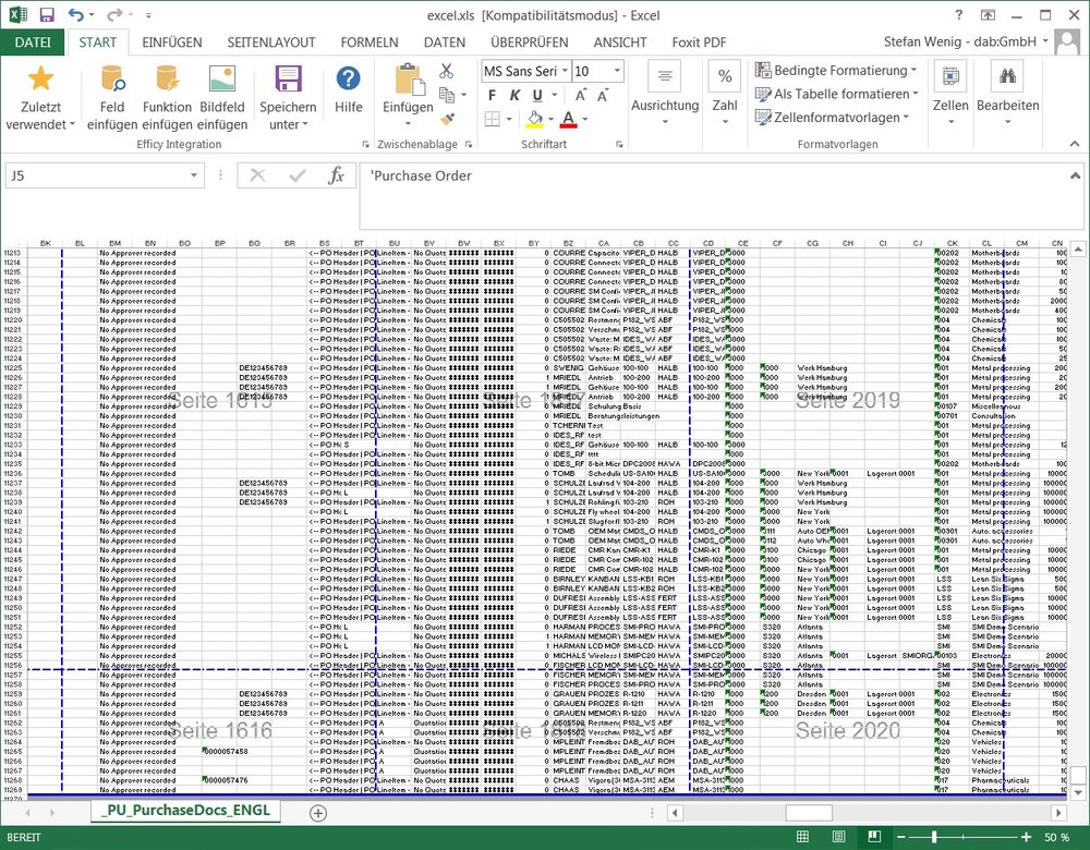
Excel table with SAP® purchasing documents (11,268 data records, 224 columns, - printout amounts to 5050 A4 pages)
This is a perfectly representative example, as day-to-day analysis work often involves huge volumes of data. However, a further challenge lies in the fact that many data analysis tools are exceedingly cumbersome from a technical perspective. To be able to use all of Excel's functions to full effect, you need to be very familiar with the functions portfolio. A basic knowledge of generating macros is also handy, too.
This was also true of ACL™ for some considerable time. To analyse data constructively, you needed a sound understanding of the ACL™ interface. Technical aspects such as data types, field lengths, relationships between primary keys and foreign keys, relational data models, classification and sum structure were also indispensable for gaining an overview of the data.
Having produced a result, a user might manage to filter and compress the original 3,578,433 vendor items so that "only" 10,673 remained. However, viewing and profiling such five to six figure result sets from a bird's eye view was still difficult.
Solutions are now available where visualisations help create a bridge between these vast data volumes and the required overview of the data. We will use the example of the ACL™ analysis software to demonstrate how this can be done.
We have been working with this software since 2002 and are familiar with the tool's history. ACL™ Analytics was the flagship data analysis tool for some considerable time. In our opinion, one of its weaknesses was the situation we described in the introduction – namely that it was really only specialists and tech-savvy analysts who grasped the appeal of the analysis opportunities (virtually no data record restrictions as in Excel™, predefined analysis commands, procedures such as Benford analyses, fuzzy duplicates analyses, etc.).
Paradigm shift and diversification
Recent years have seen a paradigm shift, however. It was recognised (not only by ACL™) that to make data analysis accessible to a broader group of people, it is essential to offer different ways to use data analysis results. This was achieved by making the user (and not the tool itself) the focus of attention. Different users have different levels of existing knowledge and will probably prefer to use different methods when working with data and analysis results. This is now taken for granted and appropriate account is made of the fact when establishing the architecture of an analysis environment.
Architecture of the solution
In the case of ACL™, the solution is outlined in the following graphic:

Let's explain this in more detail: The AX web client (shown in the bottom right of the architecture graphic as "web browser") offers browser-based access to data analysis projects which are stored centrally on the company's (own) server. These projects are collections of elements, e.g.
- Raw data
- Analysis routines
- Results
- Related files
Before looking at the 6 options for the web client in more detail, let's briefly explain these four terms:
Raw data:
These data are extracted from a source system (e.g. SAP® ERP ECC 6.0) and are available as a copy on the analysis server. The data could, for example, be data relating to a supplier base and accounts payable, and also purchasing documents. In the architecture graphic above, these data were extracted from the source system on the left and are available on the central analysis server.
Analysis routines:
These are predefined analyses which are started either manually or automatically and which analyse the raw data and generate results. Examples here could include a duplicate payment analysis, which is automatically performed each month based on accounts payable data and the result of which is produced as a list of potential duplicate payments. In the graphic above, these are located on the central server together with the raw data.
Results:
By filtering or compressing generated data, ideally suited to give an overview of a dataset or to understand situations at individual document level. If for example the aim of the duplicate payment analysis is to give the accounting department a list of potential multiple payments for processing, then the individual transaction becomes a focus. The aforementioned flexibility also comes into play: The results can be provided in different ways, ideally tailored to the user's preferred method of working. Tech-savvy users can use the ACL™ desktop analysis tool and Excel™ specialists their beloved Microsoft Excel™, while browser-based access undoubtedly presents the easiest option. These three options are indicated on the right-hand side of the graphic.
Related files:
These can be data which are automatically directly included in the analysis logic (e.g. a file containing internal suppliers, which are not to be considered during the duplicate payment analysis) or additional information such as analysis documentation or similar accompanying material. I have mentioned these for the sake of completeness – they would be stored centrally on the server and every user can view/download them.
Data analysis of the huge source data volumes is thus performed centrally on a server, ideally as automated as possible. Results are then generated in different ways, depending on the concept and on user requirements. In this blog post we are focussing on the possibility of browser-based working with data and on simple but effective visualisation. Strictly speaking, this goes beyond simply generating graphics, but we will explain this in more detail later.
Possibilities for analysing data via a web browser
Moving on from this brief diversion about the architecture and the technical possibilities offered by central data analysis based on a client/server structure, we will now look at the opportunities offered for working with data in a browser and for improving the ability to interpret results:
- Viewing data
- Filtering and sorting
- Conditional formatting
- Generation of graphics
- Adjusting the view
- Re-usability of the interpretations
The first five points are options which can be used for the data on an ad-hoc basis. In point 6 I will then go on to explain the concept of "interpretations" in this connection, which makes it possible to re-use points 1 to 5.
As an example, I will use the 11,268 order items from the introductory Excel example. This will serve as an analysis result, for which we want to obtain an overview.
1. Viewing data
Both the raw data and also the analysis results can be viewed in the browser. The latter are versionised, i.e. if an analysis is, for example, performed monthly, it is also possible to access previous results via a results history.

Since very different results files can be produced within an analysis run, these are listed and can be opened for viewing by means of a simple click.

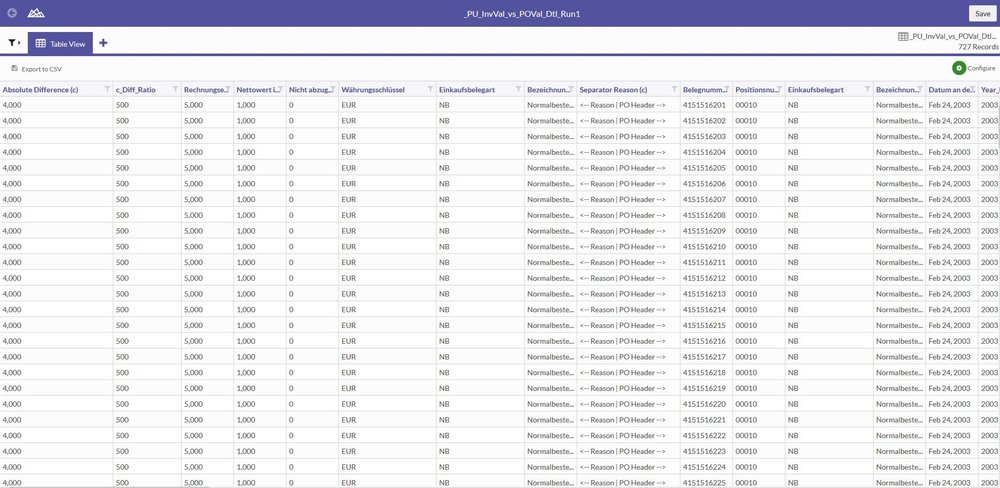
The data records can now be viewed. In the case of larger volumes of data, the table is not loaded in its entirety but is loaded gradually as the user scrolls the data.
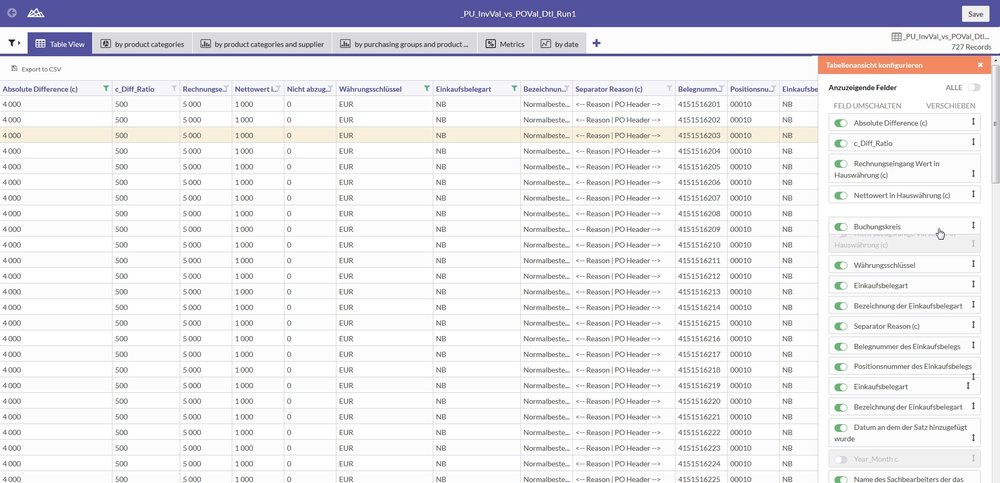
2. Filtering and sorting
If a user wants to sort the table, he simply clicks on the corresponding column and selects the sort direction. Filters can also be set in this way. In our example, the data were sorted by document type. The filter(s) then appear superimposed on the left-hand side, where they can then be further expanded or changed. A convenient feature is that the filters can be easily deactivated or even re-activated later. In the example, an amount filter was added so that only amounts in excess of EUR 2,500.00 were shown.
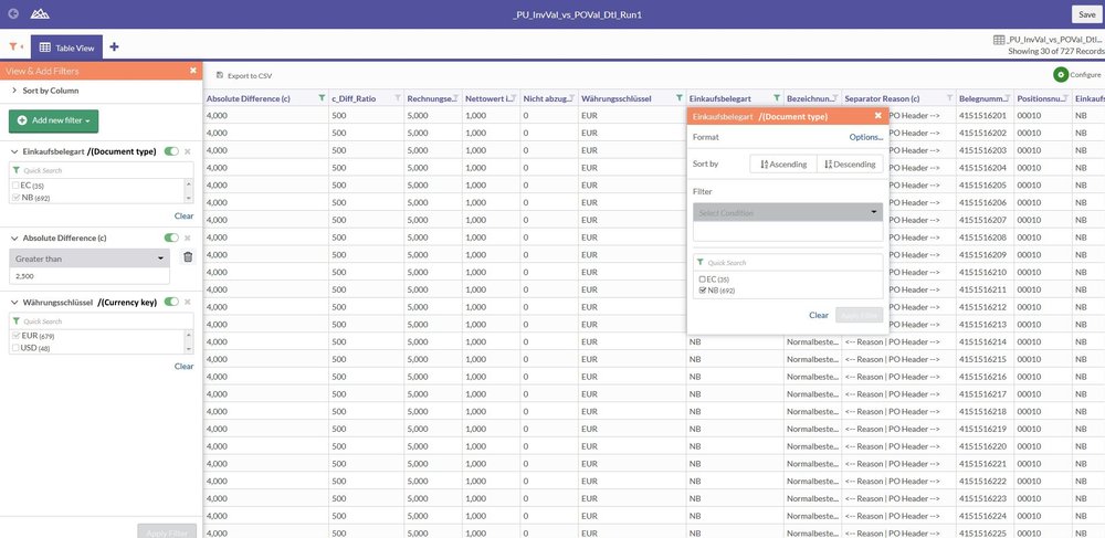
3. Conditional formatting
Browsers are actually not primarily intended for viewing large volumes of data as a browser's display and operational elements are not designed for this and are instead more suited to viewing websites, texts, images and videos. Searching for specific information can therefore be more strenuous and somewhat more cumbersome than if using a designated data analysis tool. The ACL™ web client makes things easier by enabling users to perform some simple formatting processes. In the example, data records in a foreign currency (USD for US dollars) were highlighted. Despite the large volume of data records, these are now immediately visible as they are highlighted accordingly.

4. Generation of graphics
One of the best features is the simple generation of visualisations. The ACL™ web client offers a sound set of graphic types which can be applied to the data. In our case, we generated a pie chart based on product categories, additionally product categories per supplier shown broken down as a stacked bar chart.

They are also interactive because the corresponding entries in the legend for the graphic can be dynamically modified by simple selection/de-selection.
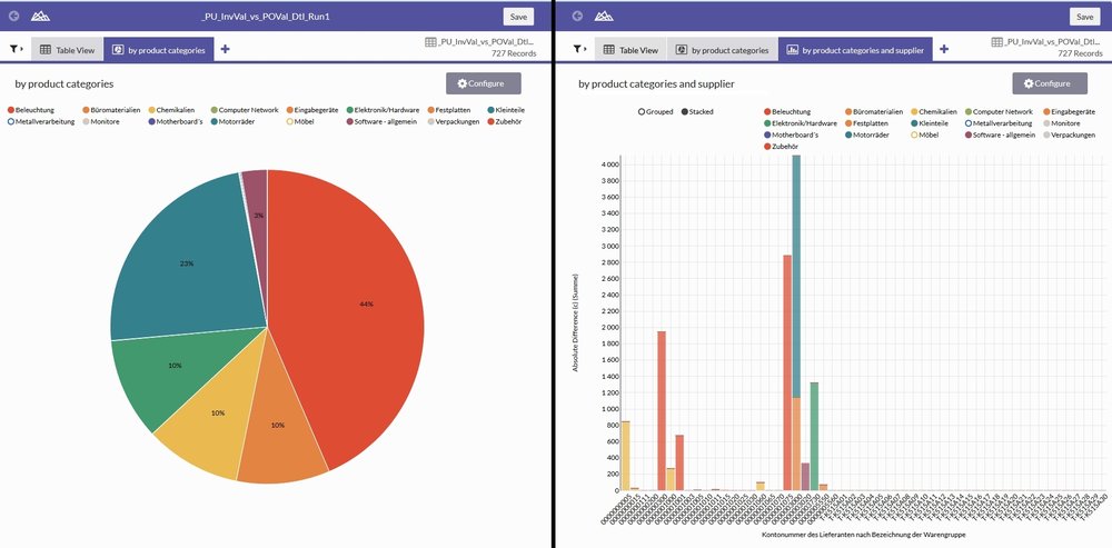
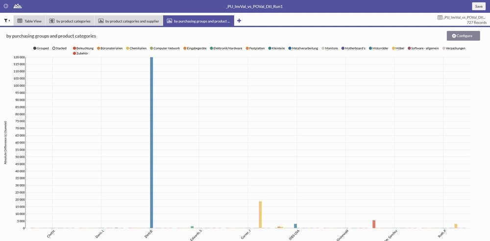
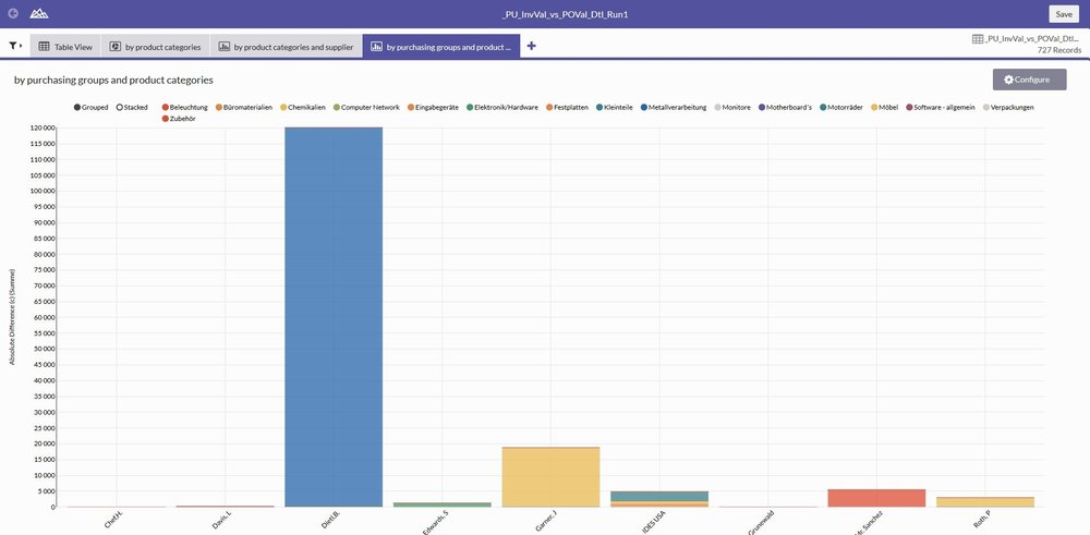
A second example used a histogram to analyse purchasing groups by product categories. If displaying the bars next to each other becomes too confusing, the whole analysis can also be displayed dynamically stacked.
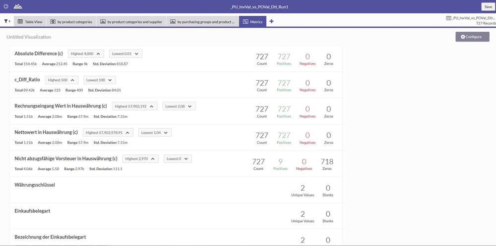
Metrics are also listed under the graphics. Strictly speaking, these are not graphic elements, but they do give a good overview of the key properties of a field (e.g. total, average, maximum and minimum).
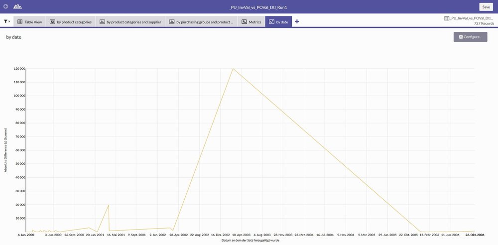
The final example shows the differences over time as a simple line chart, with the date on the x-axis and the summed up difference for this point in time on the y-axis.
5. Adjusting the view
Sometimes, a table containing raw data or results can contain multiple columns. If a user does not require all of the columns, he can simply deactivate them in the display. The order can also be sorted again so that the most important information is immediately visible. Unnecessary horizontal scrolling can be avoided by adjusting the view so that ideally, the user has the required information at a glance in front of him.
6. Re-usability of the interpretations
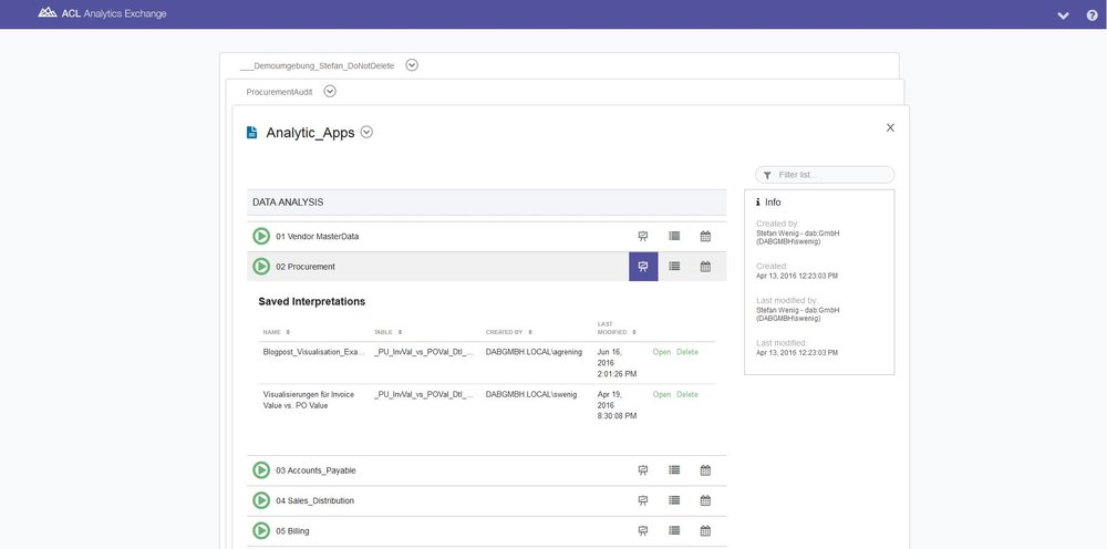
The individual possibilities offered by browser-based access are intuitive and easy to use, yet still very constructive. However, deciding which filters, conditional formatting, graphics, metrics and views are best is of course still quite a complex process, as is actually implementing this in practice. But what happens if the analysis is performed again (e.g. a monthly duplicate payments analysis, a daily analysis run for "payments in critical countries", or simply preparation of the next audit for another department which is due to be audited)? ACL™ summarises the elements filter, conditional formatting, graphics, metrics and view as "interpretations". These can be stored.
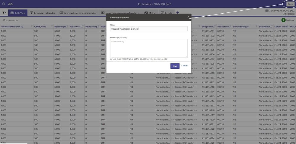
As well as ensuring they are retained for the current analysis, this also means that the stored interpretation can be used in its entirety for a new analysis result, or even for results generated in the past, provided the structure, etc. is identical.

Conclusion
In contrast to purely locally installed analysis solutions, a client/server architecture enables data and results to be made available to users in the most suitable form for them. A fresh approach here is browser-based access to data and analysis results. This offers simple but constructive ways of interpreting results using metrics, graphics, conditional formatting, comfortable filtering or adjustment of views. The sum of these possibilities can be stored and re-used as interpretations. The aim here is not to replace special tools such as the Tableau visualisation software, but to support the data analysis process as much as possible – from source data to analyses of the detailed results through to interpretations. Although a user may be faced with huge data volumes, this makes it possible for him to see the wood despite the many trees – in other words, to draw the right conclusions from his data and identify interesting facts without having to worry too deeply about technical aspects.